Designing an Enterprise Buying Cycle for a Leader in Global Ecommerce

UX/UI Design
Role
Project Support
Time Line
5-6 Months
Tools
Figma, Notion, Typeform, Claude, Dovetail, Wordpress
Client Overview
ESW is a global ecommerce enabler, helping brands sell and scale internationally by managing the complexity behind cross-border commerce: payments, compliance, shipping and returns.
Despite the scale of what ESW does, their website wasn't doing the job of explaining it. This case study covers the redesign of their site to support how enterprise buyers actually research and decide.
+22%
Conversion Rate
+38%
Avg. Session Duration
The Problem
Enterprise software isn't bought on impulse. It's bought after weeks, sometimes months, of internal research, comparison and stakeholder buy-in. ESW's website wasn't built for that journey.
The site spoke to visitors who already knew ESW, but did little for the buyer still trying to understand the offering, weigh it against alternatives and build a case internally. As a result, serious prospects lost momentum at exactly the point where the site needed to carry them forward.
The Solution
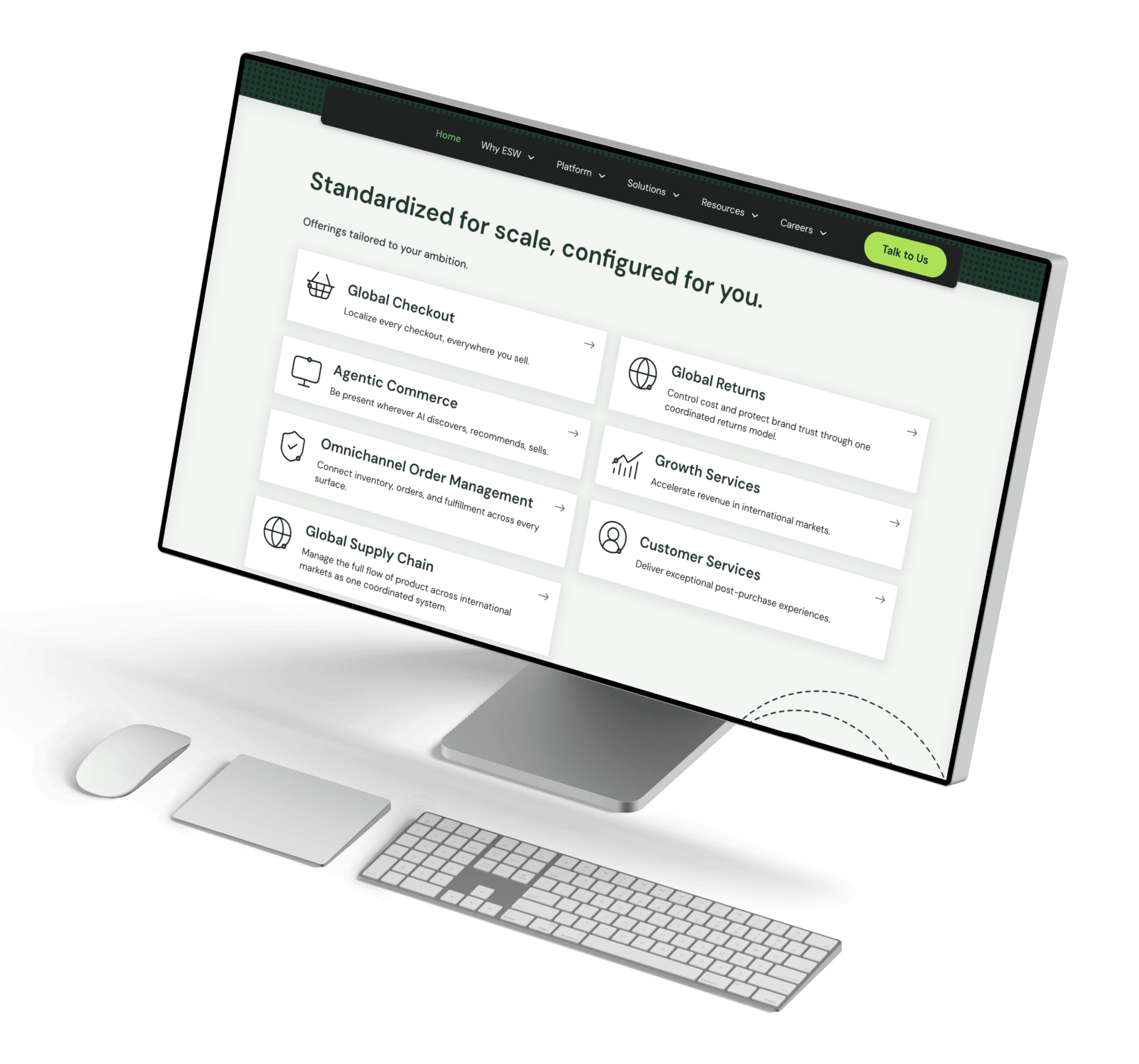
We reshaped the website around the buyer rather than the business, turning it into an experience that meets prospects wherever they are in their research, earns their confidence with clarity and proof, and gives them what they need to move a decision forward internally. Rather than a brochure, the site became an active part of the buying journey.
The Design Process
From initial discovery to build, this process shows the decisons and research that shaped ESW's website

Research
We ran surveys with existing ESW clients and prospects across the industry to understand where buyers were actually getting stuck. Alongside this, we carried out competitor analysis and a benchmarking exercise, mapping how ESW's site performed against competitors and where the bar needed to be set.
Methods
Surveys
Competitor Analysis
Competitive Benchmarking
What the Research Told Us:
01
Case Studies, Testimonials and social proof
Case studies, testimonials and social proof came out as the most trusted content type. Buyers wanted to hear from other customers, not from ESW.
02
Data-driven results and ROI
Data-driven results and ROI ranked a close second. Buyers needed numbers to back any claim, not marketing language.
03
Uncertainty before evaluation
Early-stage buyers often weren't sure their problem was even worth solving yet, let alone which vendor to trust, so content had to work harder before evaluation even started.
Three core problems emerged from our research:
1
Complex Offering, Unclear Story
Buyers struggled to understand what ESW actually did, what products they offered, and why it mattered to them.
2
No Mid-Journey Research Funnel
Once buyers moved into deeper evaluation, there was little content to support them. The information they needed to keep researching just wasn't there.
3
Unsupported Decision Progression
Buyers need to build a case internally before moving forward. ESW's site gave them nothing to help: no proof points, no reassurance, nothing to bring back to their team.
RESULT
Research gave us a clear brief, not just a list of problems, but proof of what buyers actually trust and where they get stuck. That shaped every decision from here on.
Wireframes
We took a desktop-first approach, since the majority of ESW's traffic comes from desktop. From there, wireframing became about translating the three problems research had surfaced into structure: giving the site a clearer story, building in the content buyers needed mid-journey, and creating a flow that could support a decision, not just a first visit.
Methods
Information Architecture Mapping
Low-Fidelity Wireframing (Figma)
Content Hierarchy Planning
What We Focused On:
01
Restructured the information architecture around how buyers think, not how ESW is organised internally, grouping products, services and resources into pathways that made sense from the outside in.
02
Gave case studies, proof points and data-backed results a defined place in the structure itself, not an afterthought tacked onto the homepage, but content built into the journey at the specific moments buyers needed it: comparing options, building an internal case, or looking for reassurance before moving forward.


03
Designed navigation and page flow to stay consistent across visits, so buyers deep in a long research process could resume exactly where they left off and not lose the momentum they'd need to build a case internally.
RESULT
Wireframes gave the site a structure built for the buyer, not the business. Proof and reassurance had a clear place. Returning visitors wouldn't lose their thread. That structure became the backbone for everything visual that came next.
Client Collaboration
ESW's team knew their business better than we ever would, so we worked closely with them throughout the project. Weekly sessions covered progress, timeline and deliverables, while keeping business goals and buyer needs in the same conversation. These meetings also gave stakeholders somewhere to raise concerns early enough to act on them.
Methods
Weekly Review Sessions
Stakeholder Feedback Rounds
Figma Walkthroughs

How we worked together:
01
Reviewed structure before visuals
Wireframes were walked through with the client each week, so decisions about hierarchy and content were agreed while they were still cheap to change.
02
Turned feedback into tracked decisions
Every round of comments was logged and resolved in the open, which kept stakeholders aligned and stopped the same debate resurfacing later in the project.
03
Kept commercial and buyer needs balanced
Where the client's priorities pulled against what research showed buyers needed, the decision was made together and the reasoning recorded, rather than quietly resolved in the file.
RESULT
Structure, feedback and competing priorities got resolved as they came up, not stockpiled for later. The team moved into visual design already aligned, with no late-stage rework.
Moodboard & Visual Direction
With the structure agreed, the visual direction had a specific job: look credible to an enterprise buyer and stay quiet enough that proof and data carried the page. We collected references from enterprise platforms buyers already trusted, audited how competitors presented themselves, and brought a direction back to the client before any screens were designed.
Methods
Moodboard
Competitors Visual Audiit
Stakeholder Session

We walked the client through the moodboard deck, discussing what felt like ESW and what didn't. Marketing, sales and leadership all joined, so we could hear everyone's take directly and work through any differences together in the moment, rather than waiting on separate feedback after the fact.
By the end of the session, everyone had aligned on the same direction.
What We Agreed On:
01
Mixed Theme of Branded, Light, and Dark
Use a mix of a branded theme and dark theme to give the website the feeling of a trustworthy, enterprise level company.
02
Avoid Generic Stock imagery Whenever Possible
Avoid using stock imagery and instead use illustrations, icons, and texture to communicate information.
03
Typography carries the message
Strong use of typography in headings and key sections to communicate important messaging and information.
RESULT
This session gave us a shared knowledge of how the site will visually look. Visual direction was reviewed, agreed, and signed off in the one session leaving no time wasted for rounds of feedback. We know had a clear brief to work from before beggining the UI phase of the project.
UI Design
With structure locked in from wireframes and direction set from the moodboard, we moved into designing the interface itself. This stage turned those decisions into real, working screens, built to look and feel like ESW while clearly communicating what they offered.
Methods
Design System
Component Library
Figma UI
Design System & Component Library
The site was too large to design page by page, and the client's team would be adding content long after the project ended. So the library came before the pages, each piece built once with its variants and states defined, then assembled into screens.
Reusable buttons, cards, navigation elements and content blocks meant every page followed the same rules, and gave ESW's team a consistent foundation to build on as the site keeps growing.


Key Design Choices
01
Separating User Journeys
ESW's contact flow was mixing two very different audiences together. Online shoppers needing help with an order, and prospect clients exploring ESW as a business were both funnelled through the same enquiry stream, making it harder to route and respond to each properly.
SOLUTION
We split this at the contact button itself, letting visitors choose between shopper and brand. Each group now reaches the right place immediately, and enquiries stay properly grouped by need instead of getting tangled together.
02
Rebuilding the Navigation
ESW's site had no clear structure for prospects to browse by. Without a defined path through the offering, visitors were left hunting for information rather than finding it.
SOLUTION
We rebuilt the navigation around ESW's core offerings, solutions, products, use cases and resources. This gave every visitor a direct path to what they needed, cutting down the time it took to find the right information.
03
Proof of Impact
Research had already shown proof was the content buyers trusted most, yet ESW's site asked visitors to take their claims on faith. Statistics, case studies and testimonials existed, but were easy to miss.


SOLUTION
We gave this content real visual weight and moved it higher up key pages. Buyers now see evidence of ESW's impact early, before they have to dig for it, building trust from the moment they land.

RESULT
These three decisions turned structure into a working interface: buyers were routed to the right place, found information faster, and saw proof of ESW's impact before they had to look for it. That gave us a strong, fully designed site ready to put in front of real users during testing.
Prototyping & Usability Testing
With the UI designed, we built an interactive Figma prototype covering the key journeys a prospect client would go through. We tested it remotely with five participants, walking them through real tasks rather than reviewing static screens, to see how the design actually held up in use.
Methods
Interactive Prototyping
Usability Testing
Ai Assisted Data Synthesis
What User Testing Told Us
VALIDATED
Structure and navigation
Participants moved through the site and completed tasks without major confusion, which validated the design choices made earlier in the process.
NEEDED WORK
The content & Messaging
Participants moved through the site and completed tasks without major confusion, which validated the design choices made earlier in the process.
What We Changed
01
Content Chunking
Longer blocks of copy were being skimmed over and key information was being lost. We broke this content into shorter, scannable chunks, so key information stood out instead of getting lost in the length of the page.
IMPACT
Key information is easier to indentify and digest for users.
02
Refining Messaging
On key pages, participants weren't immediately clear on what a section was telling them. We tightened the messaging so the point of each section landed faster, without needing a second read.
IMPACT
Each section now makes its point on first read, so nothing depends on the visitor going back over it.
RESULT
Testing confirmed the structure and navigation were working, the fixes needed were in the copy, not the design. Chunking content and sharpening messaging gave the site the clarity it needed before development began
Development & Client Handover
With the design tested and refined, I worked closely with the developer throughout the WordPress build. We stayed in regular contact as pages came together, making sure design intent held up once it hit the browser.
Methods
CMS Mangement
Wordpress
Client Training / Support
How We Split the Work
Developer
Wordpress Build
Template Set Up
Bug Fixes
Design Team
CMS Mangement
Content Population
Design Critique / Snag List
Client Training
Key Stages
01
Developer & UX Collaboration
As pages went live in the CMS, the developer and I reviewed them side by side against the original designs. Where something didn't translate as intended, we tracked it on a shared snag list and worked through the fix together.
02
CMS Management
Once the developer built out the reusable components in the Wordpress, I worked through building each page and populating them with real content, making sure everything read and behaved as intended. This meant we handed ESW a fully built, refined site.
03
Handover & Training
We ran a live walkthrough with ESW's team covering the CMS, followed by two weeks of ongoing support, so they could make updates and changes confidently once we stepped back.
RESULT
Close collaboration with the developer meant the final build matched the design, and ESW launched with a site their team was equipped to manage independently.
Conclusion
What Went Well:
Weekly collaboration with ESW's team kept research, design and business priorities aligned throughout, catching issues early rather than late.
Every major decision, from information architecture to content placement, was grounded in real buyer research rather than assumption.
User testing validated the structural and navigation choices before launch, while surfacing real content issues that could still be fixed in time.
Close collaboration with the developer meant the final build matched the design, with no long back-and-forth during handover.
What Could Be Improved:
Content and messaging issues only surfaced during usability testing, later in the process than ideal.
LESSON
Involve copy and content review earlier, alongside wireframes, rather than treating it as a UI-stage fix.
Testing focused on prospect buyer journeys. A wider range of stakeholder roles, procurement, IT, finance, who also influence enterprise decisions, could have surfaced additional friction points.
LESSON
When testing enterprise products, include the full range of stakeholders involved in a purchase decision, not just the primary buyer persona.
Sign-off didn't always stick. Some design and copy changes were requested by the client after a stage had already been approved, which pushed back parts of the timeline.
LESSON